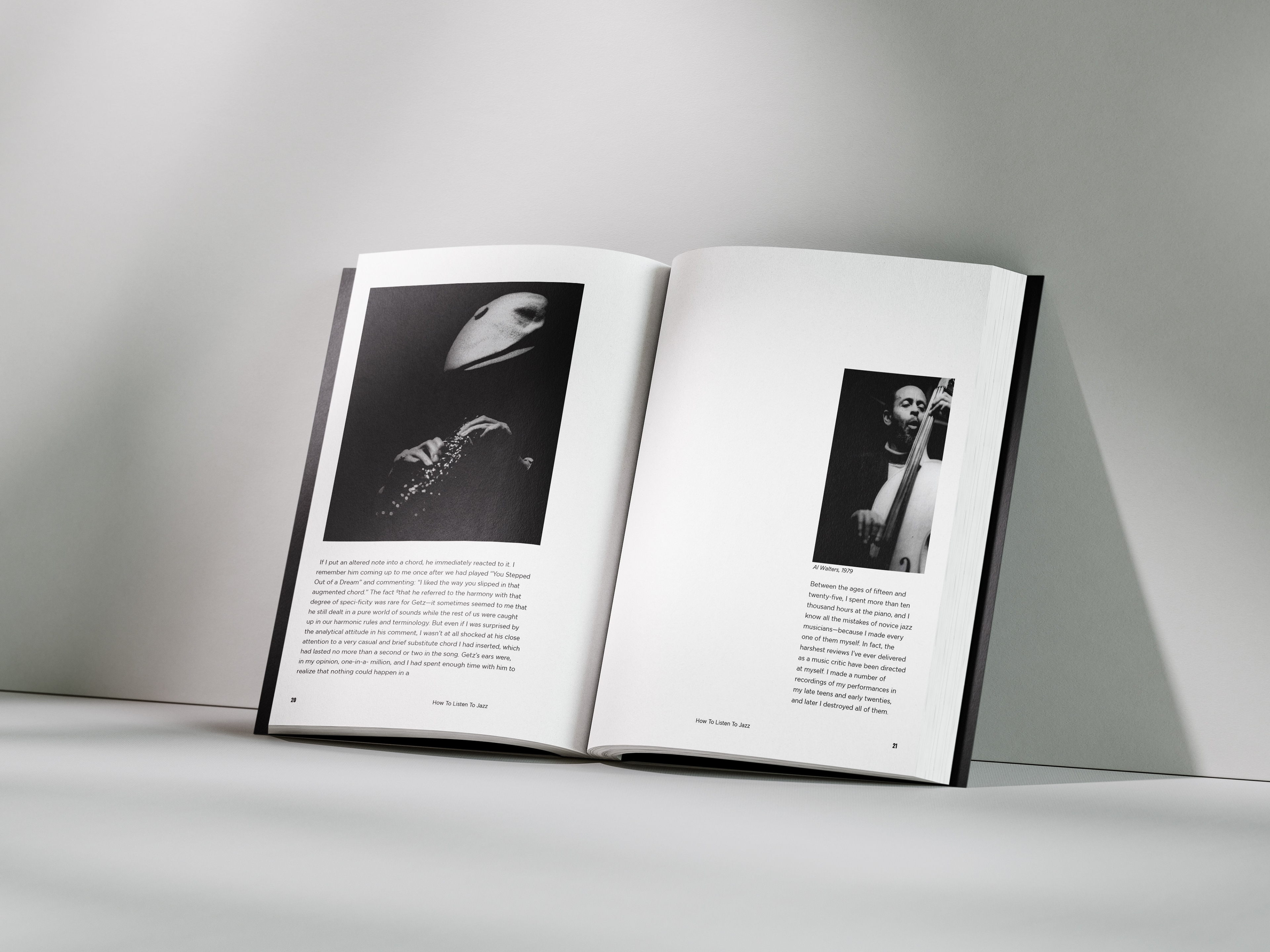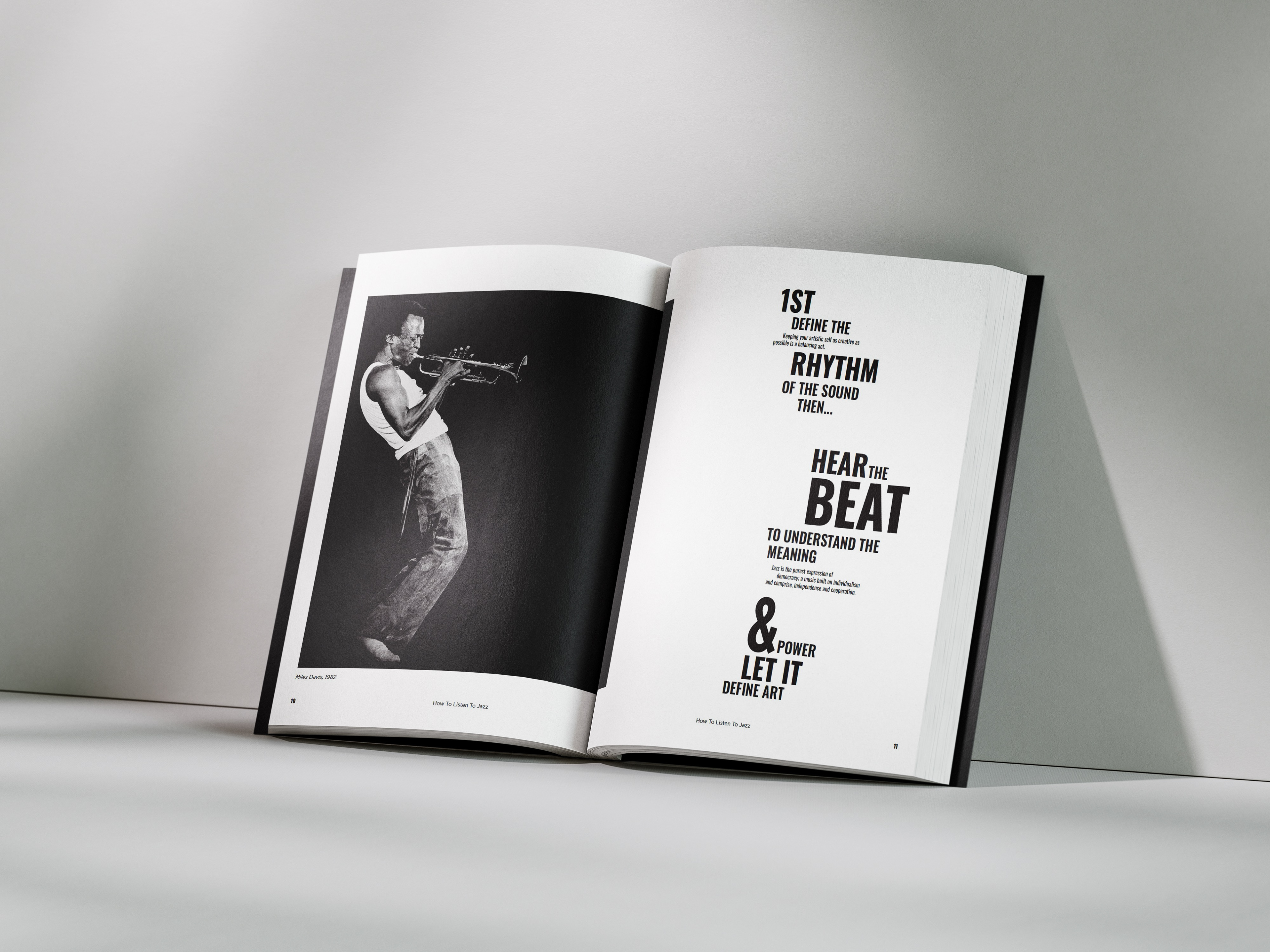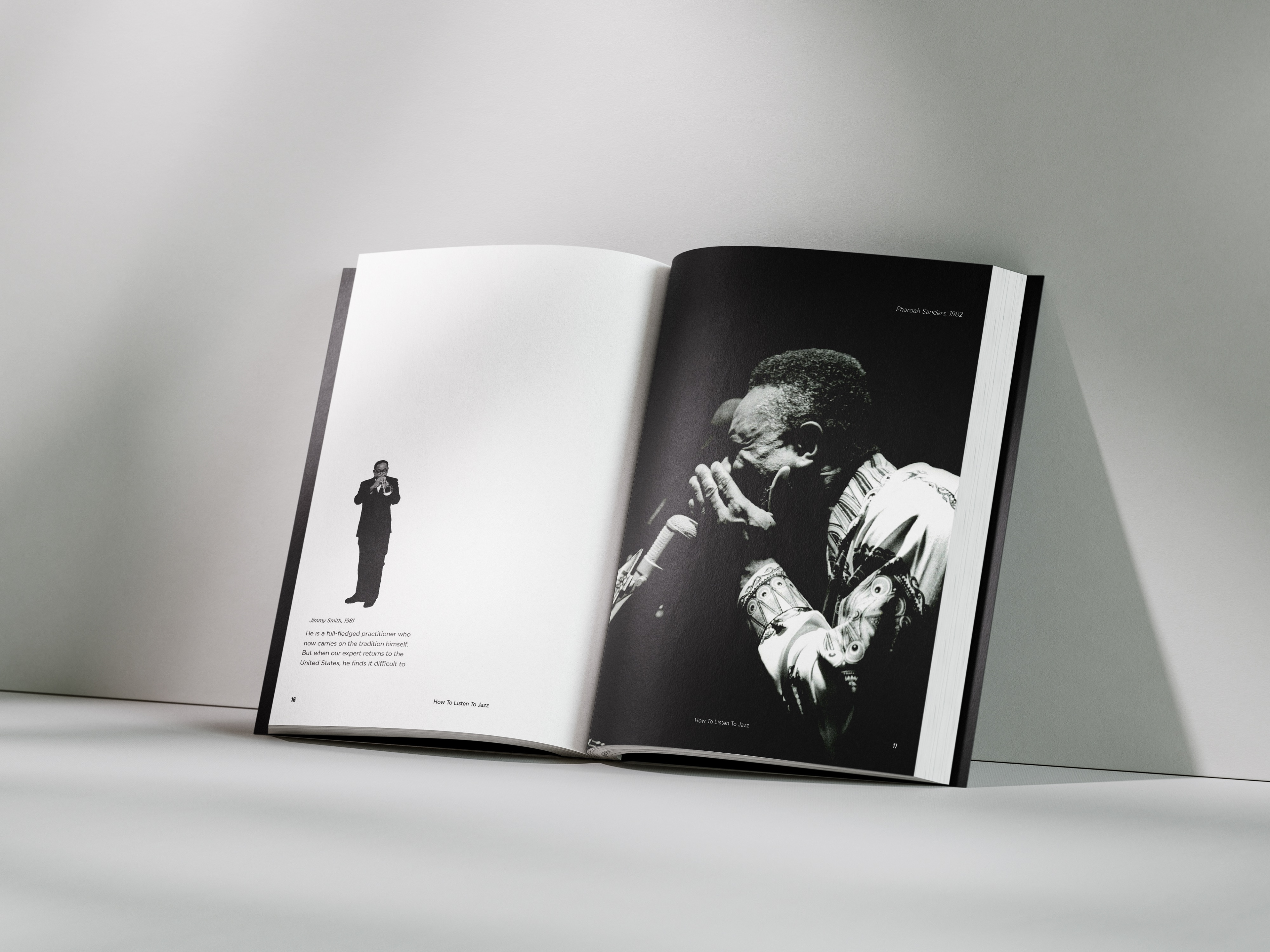
In this project, I had the opportunity to redesign a book that originally wasn't made with visuals. As my first venture into publication design, I devoted significant amount of time to researching effective layout techniques ensuring a polished and professional outcome. I had two key objectives I looked to achieve throughout this project: to honor the iconic jazz culture designs of the 1950s and '60s, and to push my typographic boundaries by exploring new styles. Inspired by the striking Blue Note Jazz album covers and similar works from that era, I was captivated by their bold black-and-white imagery, often enhanced with monochrome overlays and unique tall sans serif typography. Throughout my design process, I aimed to capture this aesthetic while adding my own twist. I focused on using dynamic black-and-white visuals to emulate the style while using InDesign to experiment and play around with the typographic composition in order to give typography its own spotlight through the publication.
The final result is a design that pays homage to the rich styles of the 50's and 60's jazz era while incorporating a modern flair.