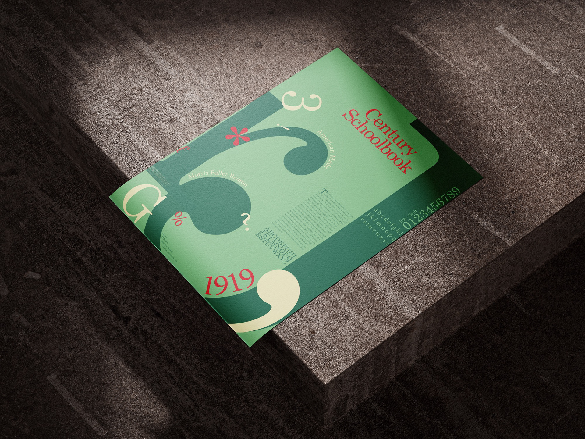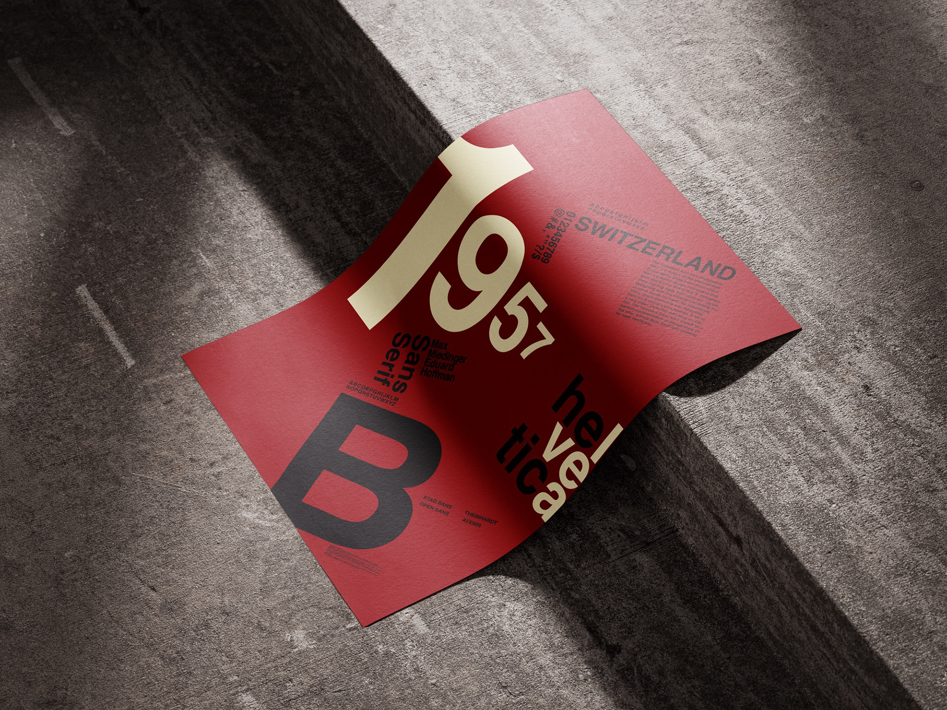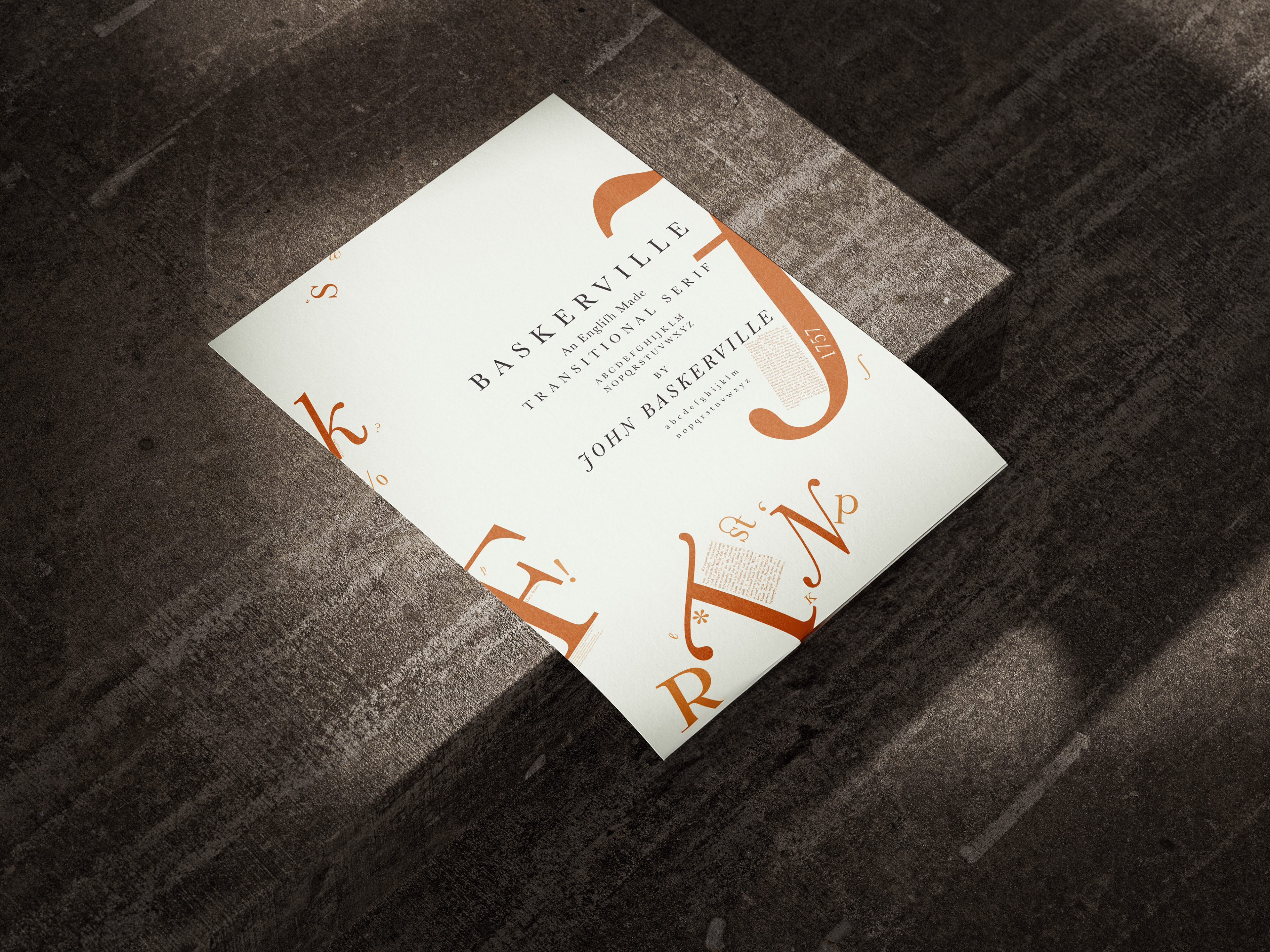
This typographic poster series was made as an exploration of varying styles of letterforms from different eras of history. By strictly utilizing the letters in a single font family I worked to create a design that not only told an interesting story through its composition, but further expressed the story of each font family’s history expressed through the stylistic choices of my design. The project began with thorough research. While there were many online resources that offered a solid understanding of the history of each typeface, I further intensified my understanding by searching for references from bookstores and libraries to find first hand sources of how each typeface was used in action. I discovered that physical resources often offered a unique insight into the technological and societal influences of the time. This served as my primary source of inspiration for this project as I further instilled my own creativity into the design process. The letters were carefully composed through various iterations on InDesign, allowing me to explore a wide range of ways to give type meaning and allow it to become the art.